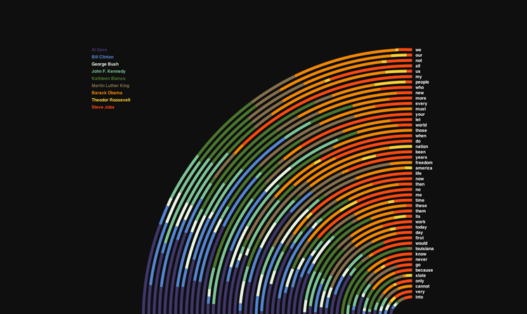
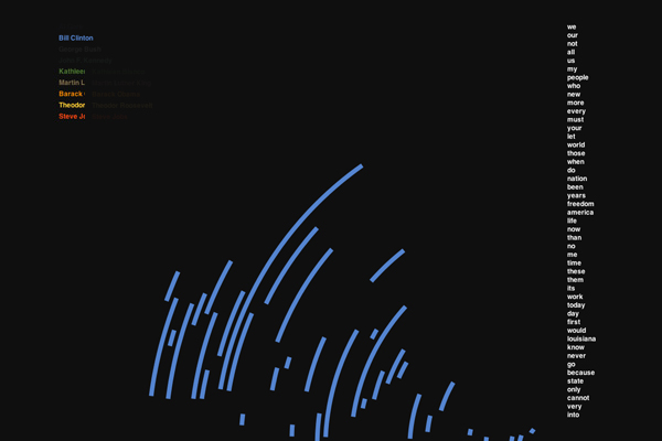
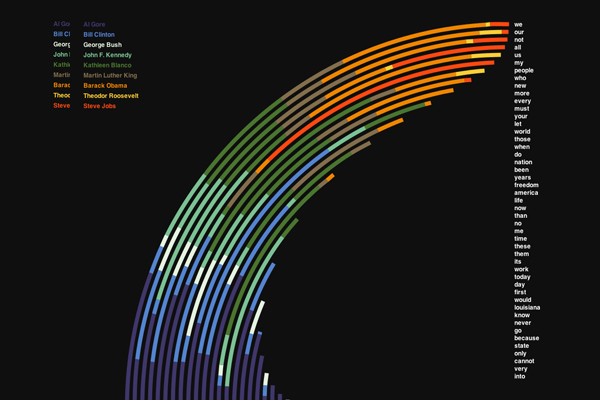
Speech Comparison
The speech comparison data visualization is a sketch built in Processing. It parses words from 9 famous speeches and displays the results in a custom diagram. All words are arranged in the right-hand side, ordered by the number of times they appear in the speeches. Each word has an arc divided into 9 colors representing the speakers. By looking at these arcs, you can see the word-use percentages of all speakers.
The design is inspired by works shown in the early Graphis Diagrams books. The sketch uses Robert Penners easing equations ported to Processing for animation.
By pressing keys 1-9 you can highlight a single speech to get an overview of the word-use. Pressing the number 0 will show all the speeches again. Pressing space will reset the sketch and show the arc animation from the beginning.
You can find the Source code on Github.